Sparkcentral
Sparkcentral's UI had remained largely unchanged since 2013. New features and experiences added over the years, in addition to the evolution of the digital customer care world, had pushed that UI to its limits. The product demanded large changes that addressed this stagnation and would carry the product into the foreseeable future and beyond.
Problems
Over the years, the product had packed several new things into a mostly unchanging UI. This resulted in a growing sense of claustrophobia; new ways to filter and sort had been crammed into fly out menus, new methods of categorization and classification were stacked into already crammed spaces. These were not only filling the screen real estate, but users' brain space as well.
Goals
My primary, high-level goal was to create a UI that has a clear purpose to the user, one that is not cluttered and confusing. Next, I wanted to create a lightweight system that would carry the product into the foreseeable future as it scales. Last, but not least, I wanted to design a modern and refreshing look; one that is more aligned with how the brand of Sparkcentral has evolved over the years.
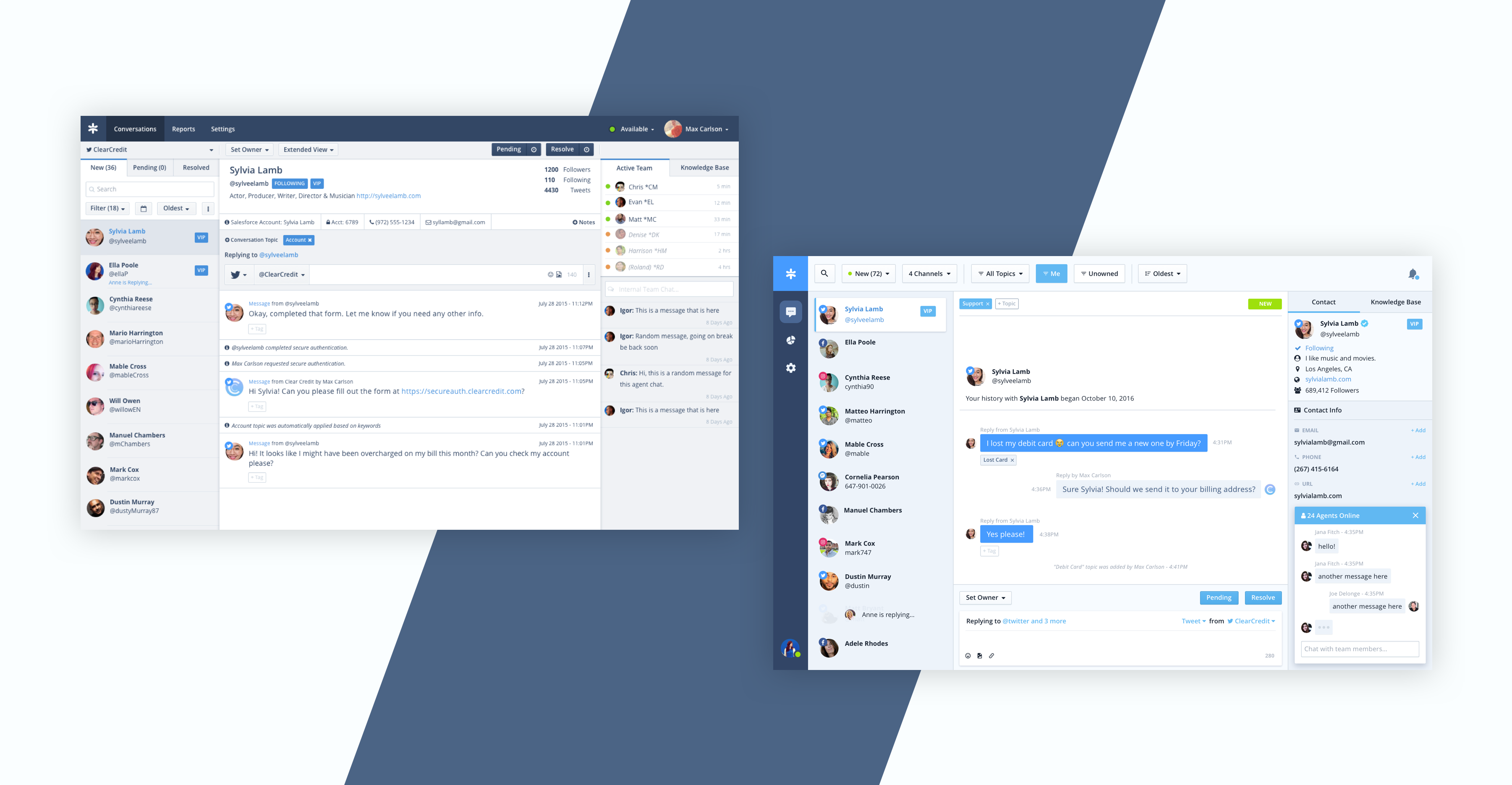
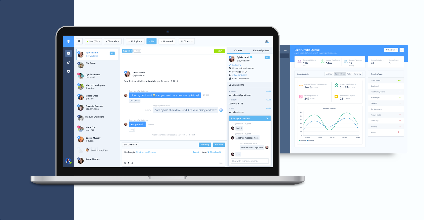
Conversation Changes
First and foremost, obvious changes were made to the conversation area to align the product better with the messaging systems we were working with and emulating. Most messaging products use a conversation layout where new messages are inserted at the bottom of the conversation. The redesign flipped this paradigm in the exchange with the customer and in the team chat component. I also updated message styles in order to better distinguish incoming messages vs outgoing messages.
Filtering Changes
Filtering and sorting components were ones that were added into the UI where possible. They were placed in a limited space, so multi-level dropdown menus were used, and were confusing. Users often forgot how their queue was being filtered, and this resulted in customers being lost and forgotten. The redesign introduces upleveled filters that are always visible and clearly communicating what they are filtering. This also removes much of the clutter from the queue area, where the queue is now only showing customers in the queue.
Contact Changes
Previously, contact information lived at the top of the conversation, in a horizontal layout. This pattern did not scale well; as contact attributes were added, valuable space in the conversation was lost. The horizontal list was hard to scan through and extract essential information. To remedy this, I moved the contact information into the right sidebar. It is now a more prominent fixture in the interface. It can feasibly accommodate dozens of contact attributes without breaking the UI or stealing space. It is also much easier to digest the list of attributes, allowing agents to easily reference information.
Want to know more?
Information provided here is only a piece of the story. If you'd like to know more about the process, research, and results of the project, please contact me and I'd be happy to share.